 Español (es)
 English (en)
Reference documentation
On this page
Anatomy of the screen
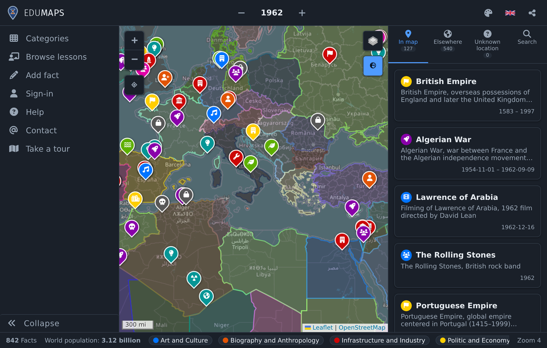
The application divides the screen between five fixed areas: the top bar, the main menu on the left, the map in the centre, the pane on the right and the bottom bar. None of them covers another: when a lesson opens, the rest make room for it.
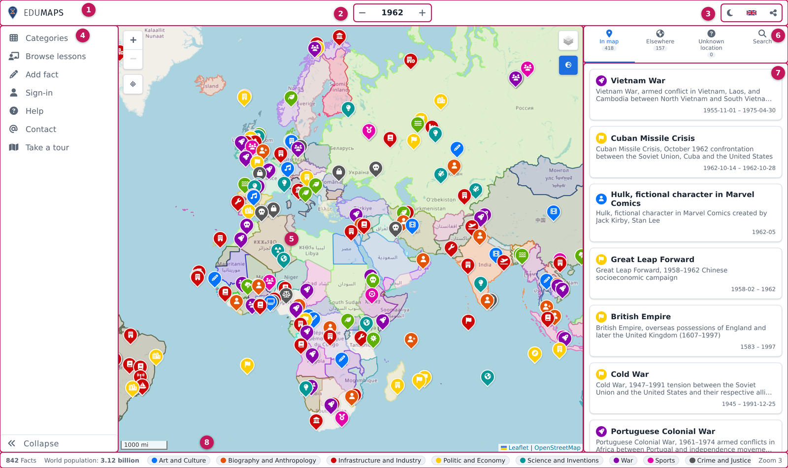
- Top bar: the brand, the time control and the general controls
- Time control: the year — or range of years — on screen. The arrows step forward and back according to the chosen precision
- Search, colour mode (light, dark and vibrant), language and share (Colour mode)
- Main menu: categories, lessons, adding facts, sign-in, help and the tour. The button at its foot expands it (MENU)
- Map: every marker is a fact, coloured and iconed by its category
- Pane tabs, each with the number of facts it holds (In map)
- Pane: the fact list for the active section, or the detail of the selected fact
- Bottom bar: fact count, world population, the categories — which double as a quick filter — and the zoom level (World population)
Top bar
It holds the brand — which goes back to the map —, the time control in the centre, and on the right the colour mode, the language and share. On narrow screens the colour mode and language buttons are hidded and the menu folds behind the three-line icon.
Time control
It shows the moment being viewed and lets you travel through it. The arrows step forward and back according to the chosen precision (day, month, year, decade, century or millennium), so the same click can move one year or a thousand. Clicking the date opens the picker, where a range of years can be set instead of a single one. Years from -10000 to the current one are accepted.

On screens under 768 px the date picker opens as a bottom sheet, so it can be used with one hand.
Other controls

Colour mode
There are three modes: light, dark and vibrant. The button cycles through them in that order, and the icon always shows the one you would switch to next. The first time it picks itself, following the operating system preference. The vibrant mode uses brighter colours and rounder corners.
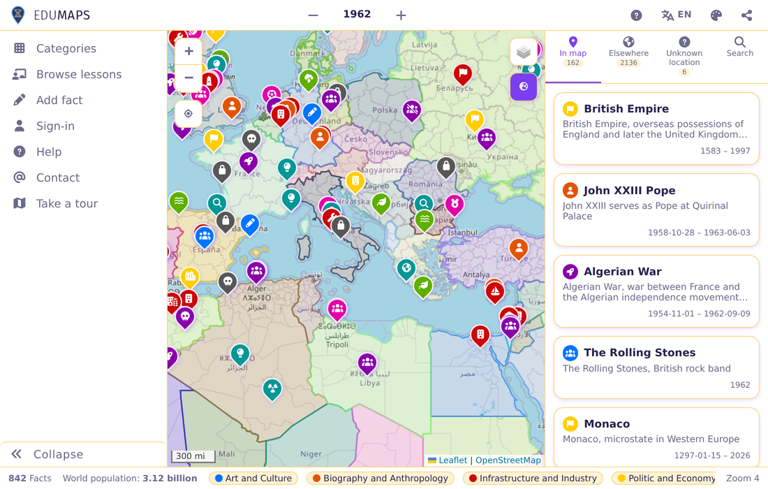
Language
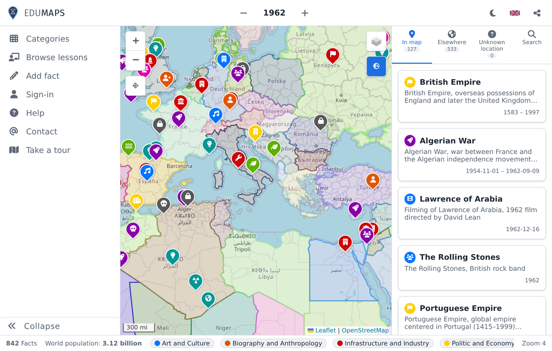
Switches between Spanish and English. Important: this is not a translation. Each language has its own set of facts, so changing it also changes the content you see.
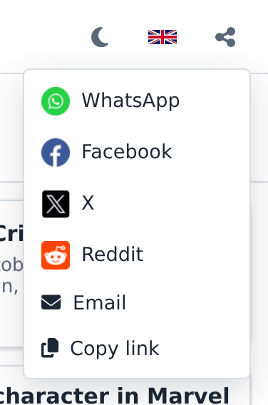
Share
Builds a link to exactly what is on screen: the year or range, the map centre and zoom, the selected fact, the lesson and its step, and the active search. Useful to cite a particular view or to send it to someone.
Main menu
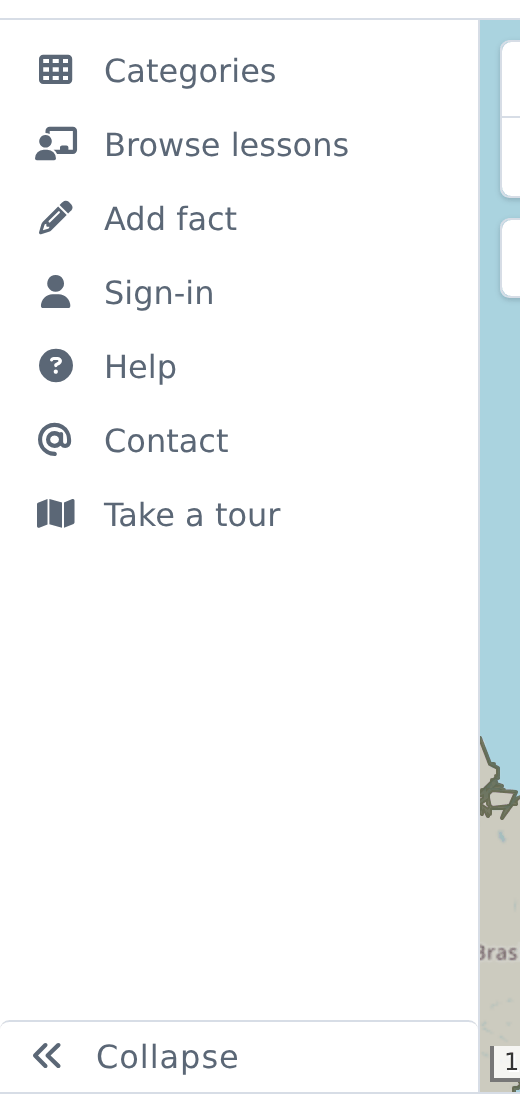
It is the left-hand column. It has two states: icons only, or icons with labels. The button at its foot — MENU — switches between them. On narrow screens it becomes a panel opened with the three-line icon.
Categories
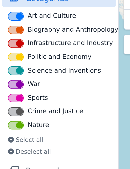
They filter the facts by type of event. Each category is a switch in its own colour — the same colour used by the map markers and by the bottom-bar labels. Below them are the shortcuts to select all and deselect all.
The rest of the menu
- Browse lessons: opens the list of available lessons.
- Add fact: opens the contribution form. Requires signing in.
- Sign-in: lets you register a user or sign in to contribute content. Once signed in, this slot shows the profile.
- Help and Contact: bring you to this documentation and to the contact page.
- Take a tour: an interactive guide through the main parts of the application.
When the screen is short and not every entry fits, the least used ones move into a
more options button (…), which also offers the colour mode and the
historical borders.
Map
It shows the facts for the selected time and place. Every marker carries the colour and icon of its category; selecting one makes it grow and stand out from the rest. A click opens a popup with the summary and shows it in the pane. The map pans and zooms like any map, and moving it recalculates which facts are in view.
Right-clicking anywhere on the map offers to add a fact at those coordinates.
Map controls
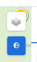
There are four controls over the map: zoom, locate (centres the map on the user), the layer selector — which switches between political and physical maps — and historical borders, which draws country boundaries as they were in the year being viewed. When the data for a border is not precise, it is drawn blurred.
Pane
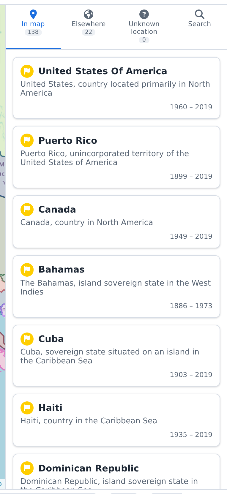
It is the right-hand column, and it always answers the question "what else was happening at this moment?". At the top are the sections, each with the number of facts it holds.
Sections
- In map: the facts for the time and place being viewed. Clicking one highlights its marker.
- Elsewhere: those from the same moment but outside the visible area. Clicking one moves the map to it.
- Unknown location: those from the same moment whose place is generic or unknown. They do not move the map.
- Search: the results of the last search.
Lists show up to 120 items at a time; when there are more, the footer states how many
are shown out of the total, for example 120 / 404.
Fact detail
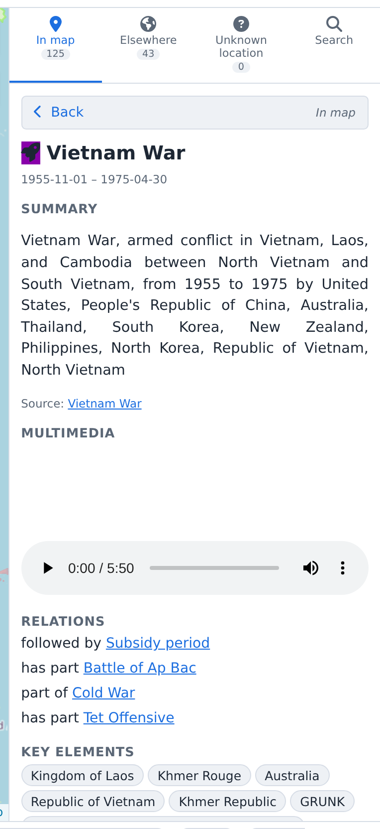
Selecting a fact replaces the pane with its detail. A bar at the top goes back to the list, and below it come whichever sections have content: Summary, Multimedia (audio or video), Relations to other facts, Key elements and Also known as. It closes with the date and the link to the source.
Search
Finds facts at any time and place. Results appear in their own section; selecting one makes the application travel to that moment and place and refresh the other sections, so the fact is always seen in its context.

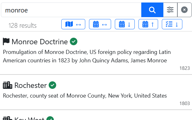
If there are too many results, the total is shown in brackets next to the number
displayed — for example 50 results (of 2897); to reach them, refine the
text being searched.
Ordering the results
The buttons above the list order it by different criteria:
- ↔ By geographic distance, nearest first. Moving the map reorders them automatically.
- ↔ By distance in time, nearest first. Since time runs both ways, earlier and later facts appear interleaved.
- ↓ By date, oldest first.
- ↑ By date, newest first.
- ↓ By relevance of the fact.
- ↓ By relevance of the result, that is its similarity to what was searched.
Advanced search
Reveals options to narrow the search: restrict it to the visible area of the map, to the active categories, or to a date range of its own.
Special searches
While no search is running, a few shortcuts are offered as a starting point — anniversaries for the day, facts from the current place and similar.
Bottom bar
It gathers four things at a glance: how many facts are loaded, the estimated world population for the year being viewed, the categories with their colours, and the zoom level. The categories here are not just a key: clicking any of them turns it on or off, exactly as from the menu.

Lessons
A lesson presents a more complex historical subject, usually spanning several facts and moments, and guides you through them step by step. The application stays 100 % usable meanwhile: the rest of the context of what is being explained is visible at all times. You can move forward and back freely, and switch between lessons. They are started from Browse lessons, in the main menu.
The lesson appears in a bar along the bottom edge of the map that reserves its own space instead of covering it. It can be collapsed, detached as a floating window and dragged, or closed.
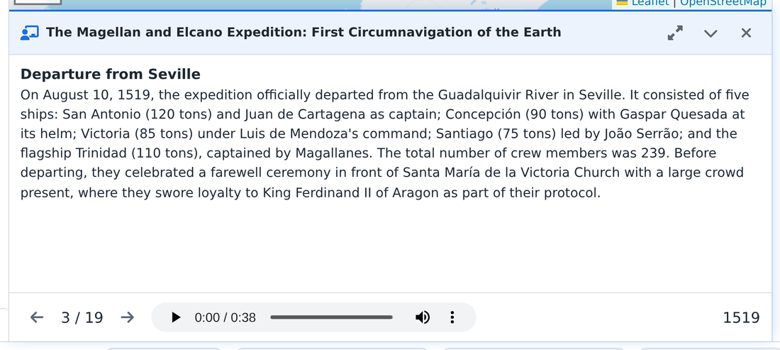
Some lessons are also narrated: next to the audio controls there is an autoplay one, which walks through the steps on its own. If the user runs another search or query it pauses, and can be resumed at will.
Lessons are context sensitive: the ones offered match the period being viewed. Users can use the existing ones or create their own, and several may coexist offering different views of the same historical process.
Smaller screens
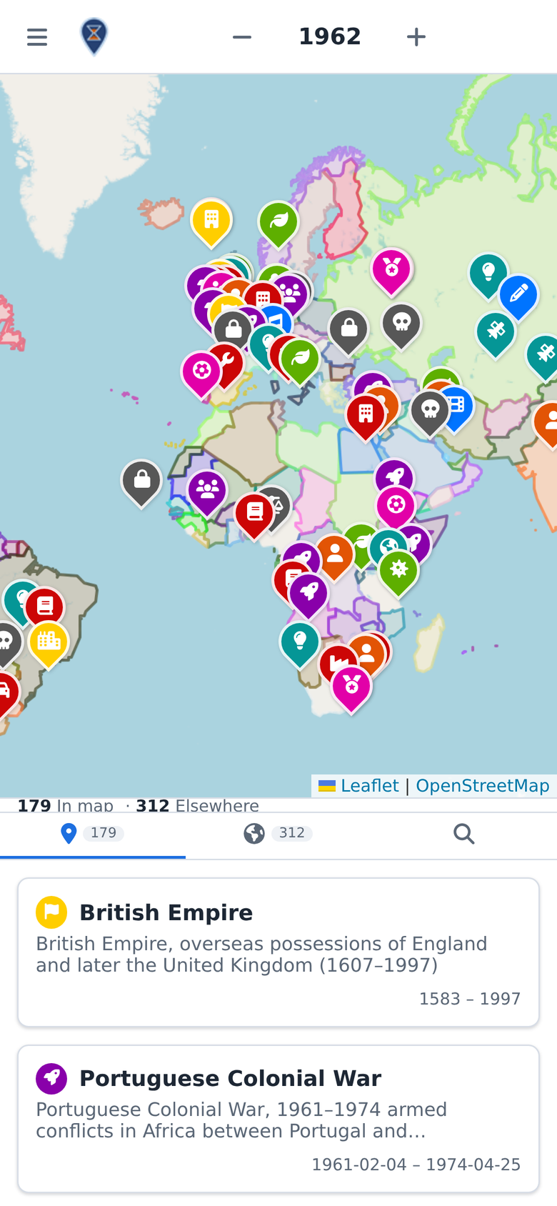
The design adapts to the screen: orientation decides how the areas are arranged, and width how much detail is shown. The content is the same. In portrait the map sits above and the pane below, the menu folds away and the date picker opens as a bottom sheet.
As the screen shrinks, some features are hidden or disabled to leave room for what matters. Specifically:
- On short, narrow screens the row with the per-section counts is dropped.
- In landscape, when there is not enough height, the least used menu entries —
add fact and take a tour — move into the more options
button (
…), so the MENU toggle stays visible. - Below 400 px share, the zoom control and the map scale are hidden. Zooming still works with a pinch or the mouse wheel.
- Below 330 px the tour no longer starts, because there is no room to point at what it is explaining.
- Below 320 px the application is replaced by a notice: the screen is too small to work comfortably.